
Last updated on July 11th, 2025 at 05:37 pm
In today’s tech-driven world, the design of AI agent icons plays a big role in how we communicate complex ideas. These icons are more than just pretty pictures; they help convey the essence of artificial intelligence in a way that’s easy to understand.
This article will look at the importance of these icons, how to choose the right one for your project, and the latest trends in AI agent icon design. Whether you’re creating an app or marketing material, knowing how to pick the perfect icon can make a huge difference.
![]()
Key Takeaways
- AI agent icons are vital for clear visual communication in tech.
- Choosing the right icon can enhance user experience and brand identity.
- Different styles, like flat or 3D, can change how users perceive AI.
- There are many resources available for sourcing high-quality icons.
- Staying updated with design trends can improve your icon choices.
Understanding The Significance Of AI Agent Icons
Role In Visual Communication
AI agent icons are more than just pretty pictures; they’re vital for how we understand and interact with AI. A well-designed icon can instantly communicate complex ideas, making artificial intelligence feel less intimidating and more approachable.
Think about it: the first thing that grabs your attention isn’t a wall of technical jargon, but a simple, effective visual. These icons act as visual shortcuts, quickly conveying the essence of AI capabilities.
Impact On User Experience
Icons play a big part in user experience. They provide visual cues that guide users through AI-driven interfaces. A clear, intuitive icon can help users understand what an AI agent does and how to interact with it.
This is especially important as AI becomes more integrated into our daily lives. Consider these points:
- Improved navigation within AI applications.
- Increased user confidence in AI interactions.
- Reduced learning curve for new AI technologies.
A good AI agent icon makes technology feel more human and less like a black box. It builds trust and encourages users to explore the possibilities of AI.
Enhancing Brand Identity
AI agent icons also contribute to a company’s brand. They help create a visual language that communicates innovation and sophistication.
A unique and memorable icon can set a brand apart in the crowded AI marketplace. It’s about creating a visual identity that communicates technological innovation and builds recognition.
Here’s how:
- Differentiate your AI product from competitors.
- Reinforce your brand’s commitment to innovation.
- Create a consistent visual identity across all platforms.
Choosing The Right AI Agent Icon
Key Design Considerations
When you’re picking out an AI agent icon, it’s not just about grabbing the first cool-looking thing you see. You’ve got to think about a few things. First, consider what the icon needs to communicate.
Is it about speed, intelligence, or something else? The icon should give people a hint about what the AI does. Think about where the icon will live. Will it be on a tiny phone screen or a big presentation slide? It needs to look good at any size.
Also, keep your brand in mind. The icon should fit with your company’s style. It’s a good idea to create a small icon library with a few variations to maintain visual consistency across different design contexts.
Evaluating Visual Characteristics
Okay, so you’ve got some ideas. Now, how do you actually judge if an icon is any good? Well, start with clarity. Can you tell what it is at a glance? If people have to stare at it for five minutes, it’s a no-go.
Scalability is also key. Does it look sharp when it’s tiny and when it’s huge? If it gets blurry or weird at different sizes, ditch it. Color matters too. Colors can send different messages.
Blue might feel techy, while green could feel more natural. Pick colors that match the vibe you’re going for. Finally, think about uniqueness. Does the icon stand out, or does it look like every other AI agent icon out there?
Balancing Complexity And Simplicity
This is where things get tricky. You want an icon that’s interesting, but not so complicated that it’s confusing. A good rule of thumb is less is more. Simple shapes and clean lines often work best.
But you also don’t want it to be boring. Try to find a balance between detail and simplicity. Maybe use a simple shape but add a subtle gradient or a small detail that makes it pop.
Remember, the goal is to represent artificial intelligence in a way that’s easy to understand and visually appealing. Don’t overthink it, but don’t phone it in either.
Finding the right balance can be tough. Sometimes, it helps to get feedback from other people. Show them a few different options and see which ones they like best. Fresh eyes can often spot things you might miss.
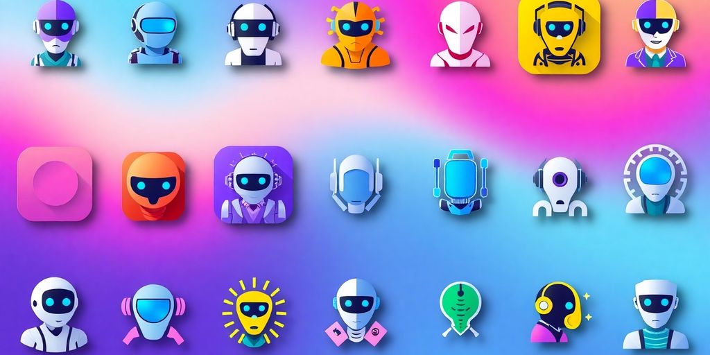
Exploring Different Styles Of AI Agent Icons
Flat Icons Versus 3D Icons
When it comes to AI agent icons, you’ve basically got two main camps: flat and 3D. Flat icons are all about simplicity. They use clean lines and solid colors, making them easy to understand at a glance.
They’re also super versatile and work well in pretty much any design. 3D icons, on the other hand, add depth and realism. They can make your AI agent look more tangible and engaging, but they can also be more complex and might not scale as well.
It really depends on the overall vibe you’re going for. For example, a sleek and minimalistic icon might be better suited for a modern app.
Minimalist Designs
Minimalist AI agent icons are all about doing more with less. Think simple shapes, clean lines, and a limited color palette. The goal is to convey the essence of AI without overwhelming the user with unnecessary details.
These designs are great because they’re easy to recognize, scale well, and can be used in a variety of contexts. Plus, they often have a modern and sophisticated feel.
Here’s a quick rundown of why minimalist icons work:
- Easy to understand
- Scalable
- Versatile
- Modern look
Minimalist icons are a great choice if you want your AI agent to appear clean, efficient, and user-friendly. They communicate intelligence without being overly complicated.
Gradient And Colorful Icons
If you want your AI agent to really pop, gradient and colorful icons are the way to go. These icons use vibrant color transitions and bold hues to create a dynamic and visually engaging representation of artificial intelligence.
They can make your AI agent look more approachable and exciting, but it’s important to use colors that are appropriate for your brand and target audience. Too many colors or clashing gradients can be overwhelming and detract from the overall design. Think about how the colors communicate the AI agent’s capability.
Common Applications Of AI Agent Icons

User Interface Design
AI agent icons are super common in user interfaces. Think about it: every time you see a little robot or a friendly face in a chat window, that’s probably an AI agent icon at work.
They’re used to represent chatbots, virtual assistants, and other intelligent systems that help users navigate websites and apps.
These icons make the interaction feel more personal and less intimidating. It’s all about making tech feel a bit more human. For example, a virtual assistant might use a specific icon to show it’s ready to help.
Marketing And Promotional Materials
AI agent icons aren’t just for apps; they pop up in marketing materials too. Companies use them in presentations, websites, and ads to show off their tech skills.
An icon can quickly communicate that a product or service uses AI, even if the details are complex. It’s a visual shortcut that grabs attention and signals innovation.
Plus, a well-designed icon can make a brand look more modern and forward-thinking.
Technical Documentation
Even in the dry world of technical documentation, AI agent icons have a place. They can provide visual context in user manuals, technical guides, and educational resources.
Instead of just reading about an AI-powered feature, users can see an icon that represents it. This can make the documentation easier to understand and more engaging. It’s all about breaking up the text and adding a bit of visual interest.
Using AI agent icons in technical documents helps users quickly identify and understand AI-related features or functions. This visual aid simplifies complex information and improves the overall user experience.
Where To Source High-Quality AI Agent Icons
Finding the right AI agent icon can be a bit of a treasure hunt. You want something that looks good, fits your project, and doesn’t break the bank. So, where do you actually find these little gems? Let’s explore some options.
Free Resources For Designers
If you’re on a tight budget, don’t worry, there are plenty of free resources out there. You can find some surprisingly good stuff if you know where to look.
- Open-source icon libraries are a great starting point. Sites like Flaticon and Icons8 have huge collections. Just be sure to check the licensing, as some free icons might require attribution.
- Individual designers sometimes release free icon sets as a way to showcase their skills. Keep an eye on design blogs and communities for these hidden treasures.
- Don’t forget about general-purpose icon sites. While they might not be specifically AI-focused, you can often find suitable icons by searching for terms like “robot,” “technology,” or “neural network.”
It’s worth noting that free icons might not always be unique. You might see the same icon used across multiple projects. If you’re looking for something truly distinctive, you might need to consider premium options.
Premium Icon Libraries
For a more polished and unique look, premium icon libraries are the way to go. You’ll usually have to pay for these, but the quality and selection are often worth it.
Consider exploring AI avatar design images on platforms like Dribbble for inspiration.
- These libraries often offer a wider range of styles and customization options.
- You’re more likely to find icons that are exclusive and won’t be seen everywhere.
- Premium icons often come with better support and licensing terms.
Open-Source Icon Collections
Open-source icon collections are another fantastic resource, especially if you’re comfortable with a bit of technical know-how.
These collections are usually free to use and modify, making them a great option for projects that require a high degree of customization.
Plus, you can often find AI agent icons that are specifically designed for AI-related applications.
- GitHub is a great place to find open-source icon collections. Search for terms like “icon library” or “SVG icons.”
- Many open-source collections are released under permissive licenses, allowing you to use them in commercial projects without restriction.
- You can often contribute back to the project by submitting your own icons or improvements.
Trends In AI Agent Icon Design
Emerging Visual Styles
Okay, so what’s new in the world of AI agent icons? Well, things are always changing, right? One big trend is moving towards more abstract representations.
Instead of just slapping a robot face on everything, designers are using shapes, colors, and patterns to suggest intelligence and automation. Think less literal, more conceptual. It’s all about hinting at AI’s capabilities without being too on-the-nose.
- Abstract geometric shapes
- Use of gradients to convey complexity
- Motion-inspired designs to show activity
It’s interesting to see how much the design language is evolving. A few years ago, everything was very literal, but now there’s a real push for more sophisticated and subtle visuals.
Adaptive Icons For Different Platforms
Another thing that’s becoming super important is making sure your AI agent icon looks good everywhere. That means creating adaptive icons that can change depending on the platform or device.
What looks great on a desktop might be a blurry mess on a phone. So, designers are now building icons that can scale and adjust automatically. This involves:
- Using vector graphics that scale without losing quality
- Creating different versions of the icon for various screen sizes
- Testing the icon on multiple devices to ensure it looks good everywhere
This is especially important as UI design for AI systems becomes more prevalent across different interfaces.
The Future Of Iconography In AI
Where are AI agent icons headed? Well, as AI gets more advanced, the icons will probably get more complex too. We might see more use of animation and interactive elements.
Imagine an icon that changes based on the AI’s current activity or status. Or icons that incorporate user feedback. The possibilities are pretty endless. It’s not just about looking good; it’s about communicating information in a clear and engaging way.
Here are some potential future directions:
- Animated icons that show AI activity
- Interactive icons that respond to user input
- Personalized icons that adapt to individual preferences
Wrapping It Up: The Future of AI Agent Icons
So, there you have it. AI agent icons are more than just pretty pictures; they’re essential tools for communication in our tech-driven world. As AI keeps changing, these icons will need to evolve too, reflecting new ideas and technologies.
Choosing the right icon can really shape how users see and interact with AI. Remember, it’s not just about looks’s about making complex ideas easy to understand.
Keep an eye on trends and don’t be afraid to experiment with different styles. With the right design, your project can stand out and connect better with its audience.
Frequently Asked Questions
What is the purpose of AI agent icons?
AI agent icons are used to visually represent concepts related to artificial intelligence. They help simplify complex ideas and make them easier to understand.
How do I choose the best AI agent icon for my project?
When selecting an AI agent icon, consider factors like clarity, color choices, and how well it scales to different sizes. Make sure it fits the message you want to communicate.
What styles of AI agent icons are popular?
Common styles include flat icons, 3D icons, minimalist designs, and colorful gradient icons. Each style has its own unique appeal.
Where can I find high-quality AI agent icons?
You can find AI agent icons on various platforms, including free resources like Flaticon, premium libraries, and open-source collections.
How do AI agent icons enhance user experience?
These icons provide visual cues that help users navigate and understand AI-driven applications more easily, making the experience smoother.
What are the latest trends in AI agent icon design?
Current trends include adaptive icons for different platforms and emerging visual styles that reflect the evolution of technology.